本系列文章配套代码获取有以下两种途径:
-
通过百度网盘获取:
链接:https://pan.baidu.com/s/1jG-rGG4QMuZu0t0kEEl7SA?pwd=mnsj提取码:mnsj
-
前往GitHub获取:
https://github.com/returu/Data_Visualization函数语法:
plt.plot(*args, scalex=True, scaley=True, data=None, **kwargs)-
*args:
plt.plot(x, y, fmt)fmt (可选):格式字符串,用于快速指定线条样式、颜色和标记点,格式为 '[color][marker][line]'。例如:'ro-'表示红色(r)、圆圈标记(o)、实线(-)。'--g*'表示绿色(g)、星号标记(*)、虚线(--)。如果省略 fmt,默认使用实线('-')且无标记点。
-
scalex, scaley:
是否自动调整横轴(scalex)或纵轴(scaley)的显示范围。设为 False 时,Matplotlib 不会自动缩放对应轴的范围。默认为True。
-
data (可选):
-
**kwargs关键字参数:
**kwargs允许更精细地控制线条样式,常用的参数包括:
|
|
|
|
|---|---|---|
|
|
|
|
|
|
|
|
|
|
|
|
|
|
|
|
|
|
|
|
|
|
|
|
|
|
|
|
|
|
|
|
|
|
|
|
|
|
|
|
|
|
|
|
|
|
|
|
|
|
|
|
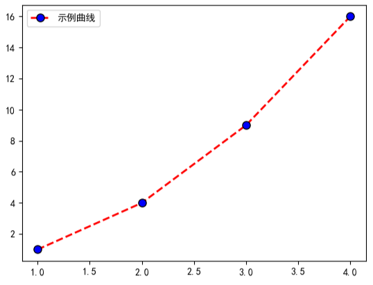
plt.plot(
    [1, 2, 3, 4],
    [1, 4, 9, 16],
    color='red',          # 红色线条
    linestyle='--',      # 虚线
    linewidth=2,         # 线宽 2px
    marker='o',          # 圆圈标记
    markersize=8,        # 标记大小 8px
    markerfacecolor='blue',  # 标记填充蓝色
    markeredgecolor='black', # 标记边缘黑色
    label='示例曲线'      # 图例标签
)
plt.legend()
plt.show()
可视化结果如下图所示:
使用示例:
-
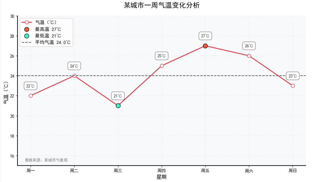
示例1:图表优化
-
突出关键数据点,例如对最高 / 最低温度等关键数据点进行特殊标记,增强视觉焦点;
-
添加平均水平线;
-
优化数据标签样式,让数据标签更精致,例如添加背景框避免与网格线重叠;
-
美化图表边框和刻度,例如调整边框显示和刻度样式,提升整体精致度;
-
添加数据来源标注。
# 准备数据
days = ['周一', '周二', '周三', '周四', '周五', '周六', '周日']
temp = [22, 24, 21, 25, 27, 26, 23]

plt.figure(figsize=(10, 6))

# 绘制折线(设置线宽和标记样式)
plt.plot(
    days, temp,
    color='#E63946', linestyle='-', linewidth=2,
    marker='o', markersize=8, markerfacecolor='white',
    label='气温(℃)'
)

# 添加数据标签
for x, y in zip(days, temp):
    # 在每个数据点上方添加数值标签
    plt.text(
        x, y + 0.8,  # 标签位置(x坐标,y坐标+0.5避免与标记重叠)
        f'{y}℃',    # 标签内容
        ha='center', # 水平居中对齐
        va='bottom', # 垂直底部对齐
        fontsize=10, # 字体大小
        color='#333333', # 标签颜色
        bbox=dict(facecolor='white', edgecolor='gray', pad=2, boxstyle='round,pad=0.5')  # 添加背景框
    )


# 找到最高和最低温度的位置,并进行特殊标记
max_idx = temp.index(max(temp))
min_idx = temp.index(min(temp))
plt.scatter(
    days[max_idx], temp[max_idx],
    color='#FF5733', s=100, edgecolor='black', zorder=5,
    label=f'最高温 {temp[max_idx]}℃'
)
plt.scatter(
    days[min_idx], temp[min_idx],
    color='#33FFCE', s=100, edgecolor='black', zorder=5,
    label=f'最低温 {temp[min_idx]}℃'
)

# 添加平均值参考线
avg_temp = sum(temp) / len(temp)
plt.axhline(
    y=avg_temp, color='#555555', linestyle='--', linewidth=1.5,
    label=f'平均气温 {avg_temp:.1f}℃'
)

# 添加图表细节
plt.title('某城市一周气温变化分析', fontsize=16, fontweight='bold', pad=20)  # 标题加粗
plt.xlabel('星期', fontsize=12, fontweight='bold')
plt.ylabel('气温(℃)', fontsize=12, fontweight='bold')
plt.ylim(15, 30)  # 设置y轴范围
plt.grid(True, alpha=0.3, linestyle=':')  # 添加网格(透明度0.3,点线)
plt.legend(loc='lower right', fontsize=11)  # 图例放在左下角

# 获取当前坐标轴对象
ax = plt.gca()

# 添加数据来源标注
plt.text(
    0.02, 0.02, '数据来源:某城市气象局',
    transform=ax.transAxes, fontsize=9,
    style='italic', color='gray'
)

# 调整背景色
ax.set_facecolor('#F8F9FA')
# 只显示底部和左侧边框,并加粗
ax.spines['top'].set_visible(False)
ax.spines['right'].set_visible(False)
ax.spines['bottom'].set_linewidth(1.5)
ax.spines['left'].set_linewidth(1.5)

plt.tight_layout()
plt.show()
-
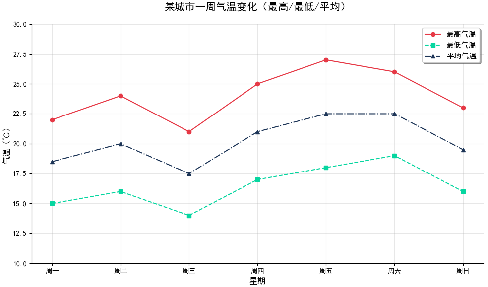
示例2:多条折线绘制
在 Matplotlib 中绘制多条折线有多种方法,核心思路是通过多次调用 plt.plot() 函数或一次性传入多组数据,
-
方法 1:多次调用 plt.plot()(最常用)
当折线数量较多时,可将数据和样式存入列表,通过循环批量绘制,减少重复代码。
# 准备数据
days = ['周一', '周二', '周三', '周四', '周五', '周六', '周日']
temp_high = [22, 24, 21, 25, 27, 26, 23]  # 最高气温
temp_low = [15, 16, 14, 17, 18, 19, 16]   # 最低气温
temp_avg = [18.5, 20, 17.5, 21, 22.5, 22.5, 19.5]  # 平均气温

# 数据与样式打包
data = [
    (temp_high, '#E63946', '-', 'o', '最高气温'),
    (temp_low, '#06D6A0', '--', 's', '最低气温'),
    (temp_avg, '#1D3557', '-.', '^', '平均气温')
]

# 创建画布
plt.figure(figsize=(10, 6))

# 循环绘制
for y, color, ls, marker, label in data:
    plt.plot(days, y, color=color, linestyle=ls, marker=marker, label=label)

# 添加图表元素
plt.title('某城市一周气温变化(最高/最低/平均)', fontsize=15, pad=20)
plt.xlabel('星期', fontsize=12)
plt.ylabel('气温(℃)', fontsize=12)
plt.ylim(10, 30)  # 调整y轴范围
plt.grid(alpha=0.3)
plt.legend(
        loc='best',          # 位置自动
        fontsize=11,         # 字体大小
        frameon=True,        # 显示边框
        fancybox=True,       # 圆角边框
        shadow=True,         # 阴影效果
          )

# 美化边框
ax = plt.gca()
ax.spines['top'].set_visible(False)
ax.spines['right'].set_visible(False)

plt.tight_layout()
plt.show()
可视化结果如下图所示:
-
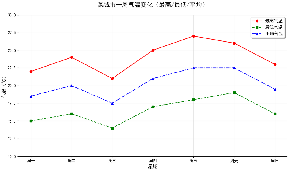
方法 2:一次性传入多组数据(简洁写法)
在单个 plt.plot() 中按 (x1, y1, 样式1, x2, y2, 样式2, ...) 的格式传入多组数据,适合快速绘图。
# 准备数据
days = ['周一', '周二', '周三', '周四', '周五', '周六', '周日']
temp_high = [22, 24, 21, 25, 27, 26, 23]  # 最高气温
temp_low = [15, 16, 14, 17, 18, 19, 16]   # 最低气温
temp_avg = [18.5, 20, 17.5, 21, 22.5, 22.5, 19.5]  # 平均气温

# 创建画布
plt.figure(figsize=(10, 6))

# 一次性传入多组数据(x相同可省略重复x)
lines =plt.plot(
    days, temp_high, 'ro-',   # 红色(r)、圆点(o)、实线(-)
    days, temp_low, 'gs--',   # 绿色(g)、正方形(s)、虚线(--)
    days, temp_avg, 'b^-.',   # 蓝色(b)、三角形(^)、点划线(-.)
)

# 添加图表元素
plt.title('某城市一周气温变化(最高/最低/平均)', fontsize=15, pad=20)
plt.xlabel('星期', fontsize=12)
plt.ylabel('气温(℃)', fontsize=12)
plt.ylim(10, 30)  # 调整y轴范围
plt.grid(alpha=0.3)

# 手动设置图例标签
plt.legend(
    handles=lines,  # 使用plot返回的线条对象
    labels=['最高气温', '最低气温', '平均气温'],  # 手动指定标签
    loc='best',          # 位置自动
    fontsize=11,               # 字体大小
    frameon=True,              # 显示边框
    fancybox=True,             # 圆角边框
    shadow=True,               # 阴影效果
)

# 美化边框
ax = plt.gca()
ax.spines['top'].set_visible(False)
ax.spines['right'].set_visible(False)

plt.tight_layout()
plt.show()
更多内容可以前往官网查看:
https://matplotlib.org/stable/


本篇文章来源于微信公众号: 码农设计师