本系列文章配套代码获取有以下两种途径:
-
通过百度网盘获取:
链接:https://pan.baidu.com/s/1jG-rGG4QMuZu0t0kEEl7SA?pwd=mnsj提取码:mnsj
-
前往GitHub获取:
https://github.com/returu/Data_Visualization-
离散时间序列数据:如每日库存量、每小时用户在线数等。 -
突变信号:如开关状态变化、价格突变等。 -
累积分布函数:统计学中常用于展示累积概率。
函数语法:
plt.step(x, y, *args, where='pre', data=None, **kwargs)-
x:数组或类数组对象,表示阶梯图的 x 轴数据(横坐标)。
-
y:数组或类数组对象,与 x 长度相同,表示阶梯图的 y 轴数据(纵坐标)。
-
where:控制阶梯的位置,可选值包括,'pre'(默认,水平线段从每个x位置向左延伸)、'post'(水平线段从每个x位置向右延伸)、'mid'(阶梯在相邻数据点之间居中)。
-
data:可选的对象(如 DataFrame),如果提供,则 x 和 y 可以是该对象中的列名(字符串),用于直接从数据对象中提取数据。
-
*args:可变参数,用于传递额外的样式参数(如颜色、线型等),可简化写法(fmt 格式字符串)。例如 plt.step(x, y, 'r--') 表示红色虚线。
-
**kwargs:关键字参数,用于精细化控制图形样式,常用参数包括,线条样式(color、linewidth、linestyle)、标记点样式(marker、markersize、markerfacecolor、markeredgecolor)、图例与标签(label)等。
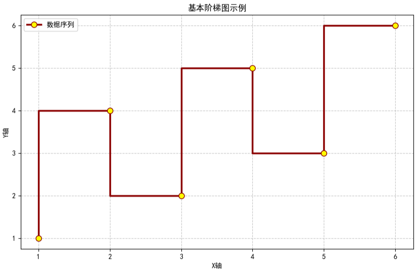
# 创建示例数据
x = np.array([1, 2, 3, 4, 5, 6])
y = np.array([1, 4, 2, 5, 3, 6])

# 创建阶梯图
plt.figure(figsize=(10, 6))

# 绘制阶梯图
plt.step(x,                  # x轴数据
         y,                  # y轴数据
         where='pre',        # 阶梯对齐方式
         color='darkred',    # 阶梯线的颜色
         linewidth=2.5,      # 阶梯线的宽度
         marker='o',         # 数据点标记样式
         markersize=8,       # 标记点的大小
         markerfacecolor='yellow',  # 标记点的填充色
         markeredgecolor='darkred', # 标记点的边框色
         label='数据序列'    # 图例标签
        )

plt.title('基本阶梯图示例')
plt.xlabel('X轴')
plt.ylabel('Y轴')
plt.legend()
plt.grid(True, linestyle='--', alpha=0.7)
plt.show()
可视化结果如下图所示:
使用示例:
-
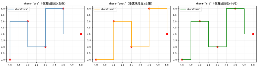
示例1:where参数
where参数是step()函数的核心参数,它决定了阶梯的样式,共有 3 个可选值:
|
|
|
|
|---|---|---|
|
|
|
|
|
|
|
|
|
|
|
|
下面通过一个简单案例,直观对比 3 种where参数的效果:
# 生成测试数据
x = np.array([1, 2, 3, 4, 5])
y = np.array([2, 5, 3, 6, 4])

# 创建3个子图对比
fig, axes = plt.subplots(1, 3, figsize=(15, 4))

# 1. where='pre'(默认)
axes[0].step(x, y, where='pre', color='steelblue', linewidth=2, label='where="pre"')
axes[0].scatter(x, y, color='red', s=50)  # 添加数据点标记
axes[0].set_title('where="pre"(垂直线段在x左侧)')
axes[0].legend()
axes[0].grid(alpha=0.3)

# 2. where='post'
axes[1].step(x, y, where='post', color='orange', linewidth=2, label='where="post"')
axes[1].scatter(x, y, color='red', s=50)
axes[1].set_title('where="post"(垂直线段在x右侧)')
axes[1].legend()
axes[1].grid(alpha=0.3)

# 3. where='mid'
axes[2].step(x, y, where='mid', color='green', linewidth=2, label='where="mid"')
axes[2].scatter(x, y, color='red', s=50)
axes[2].set_title('where="mid"(垂直线段在x中间)')
axes[2].legend()
axes[2].grid(alpha=0.3)

plt.tight_layout()
plt.show()
-
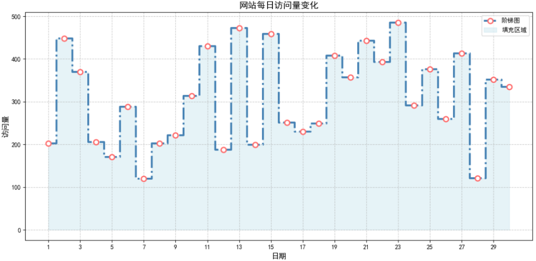
示例2:自定义样式
可通过颜色、线宽、标记点等参数来自定义图表样式。
可使用 fill_between() 函数填充阶梯图与 x 轴之间的区域,增强视觉层次感,尤其适合展示 “累积量” 或 “范围” 数据。
# 模拟网站访问量数据
np.random.seed(42)
days = np.arange(1, 31)
visitors = np.random.randint(100, 500, size=30)

plt.figure(figsize=(12, 6))

# 绘制阶梯图
plt.step(days,                  # x轴数据
         visitors,              # y轴数据
         where='mid',           # 阶梯对齐方式
         color='steelblue',     # 阶梯线颜色
         linestyle='-.',        # 线条样式
         linewidth=3,           # 线条宽度
         marker='o',            # 数据点标记样式
         markersize=8,          # 标记点大小
         markerfacecolor='white',# 标记点填充色
         markeredgecolor='#FF6B6B',# 标记点边框色
         markeredgewidth=2,     # 标记点边框宽度
         label='阶梯图'         # 图例标签
        )

# 填充阶梯图下方区域,增强视觉效果
plt.fill_between(days,           # x轴数据:与阶梯图保持一致
                 visitors,       # y轴数据:填充区域的上边界(即阶梯图线条)
                 alpha=0.3,      # 填充透明度
                 color='lightblue',# 填充颜色
                 step='mid',     # 填充模式:与阶梯图的where参数保持一致(mid),确保填充区域对齐
                 label='填充区域'# 填充区域的图例标签
                )

plt.title('网站每日访问量变化', fontsize=14)
plt.xlabel('日期', fontsize=12)
plt.ylabel('访问量', fontsize=12)
plt.grid(True, linestyle='--', alpha=0.7)
plt.xticks(np.arange(1, 31, 2))
plt.legend(loc='upper right')
plt.tight_layout()
plt.show()
更多内容可以前往官网查看:
https://matplotlib.org/stable/


本篇文章来源于微信公众号: 码农设计师